

The Xperia X10 is costly but its the top of the line sony handset with everything you can Imagine.
Design and display
"Big" is the first word that comes to mind when you see the X10. We doubt that many consumers are actually using an X10, but complaints about its size are littering user forums. We, however, take a more neutral view. Seriously, if you want a compact device, you really shouldn't be looking at a touch-screen smartphone in the first place. The X10 makes for a tight fit in a pants pocket, but it remains portable if you stick with a jacket pocket or purse.

At 4.7 inches long by 2.5 inches wide by 0.5 inch deep, the X10 is only slightly larger than the iPhone, and you hear no one complaining about that device's size. The X10 is lighter than you might think (4.8 ounces) though we enjoyed its sold feel. Its face is purposely curved; Sony Ericsson does this so the device matches the natural curve of your hand. We understand any skepticism, but it's only the slightest bit gimmicky. Indeed, the X10 fits comfortably in the hand, but it wasn't a huge leap over other handsets. On the other hand, the curved back means that when it's resting on a flat surface, the X10 wobbles if you try to tap at the screen.
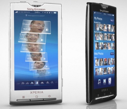
Size, of course, does have its advantages. A bulky phone can offer a sizable display and the X10 comes through with a 4-inch screen. That makes it larger than most touch-screen phones currently on the market and we couldn't fault the rich resolution (65,536 colors; 854x480 pixels). Graphics, photos, and colors were sharp and vibrant, and we could see the display relatively well in direct light. The touch interface was accurate and responsive, both when tapping icons and swiping through long lists. It even was responsive at the very edges of the display
You get three home screens that you can populate as you please with shortcuts, folders, and widgets. Like all Android phones, other display options are limited to the wallpaper, brightness, and backlighting time; the menu font size and style aren't customizable. Our only real complaint about the display is that it shows smudges way too easily. Indeed, we were wiping it clean constantly just to see it clearly. The display has the Android notifications bar and an accelerometer, but not a proximity sensor.
Below the display are the X10's only physical controls. The Home key, back button, and menu control are large and tactile, so we had no trouble using them. On the left spine you'll find the volume rocker and a camera shutter. The latter is a rather small, but it didn't pose a problem. On the top of the phone are the 3.5mm headset jack, the power control, and the Micro-USB port for the charger and syncing cable. We give Sony Ericsson major points for ditching the proprietary connections and including a microSD card slot. The slot is located behind the battery cover, but we'll let that slide in this case since we aren't stuck with a Memory Stick Micro format.
Virtual keyboard
The X10's virtual keyboard is very close to the standard Android design, but it offers a few unique elements. In landscape mode it takes advantage of the display's full size so you have plenty of room for typing. There are three rows of alphabetic/punctuation keys with separate keyboards for numbers and symbols and other punctuation. You also get a special pop-up keyboard above the alphabetic buttons that includes smileys and some symbols. That's particularly convenient since it puts oft-used characters, like a dollar sign and parentheses, right on the main screen. The space bar is conveniently located in the center of the bottom row.
We also love the X0's autocomplete function and dictionary. Instead of just one possible choice when writing a word, the X10 offers up to 20 possible choices. For example, if you type "it" you get not only "its" as an option, but also "itself," "Italy," "item," and even "ignore." What's more, the X10 is adept at remembering previously used words and offering them as suggestions even if they aren't in the dictionary. After typing "germank" just once, we got it as a suggestion each time we started typing another word that begins with G.
Not all was well in keyboardland, however. For reasons that we can't fathom you can't use the landscape keyboard in the messaging app (it does work in e-mail). When typing a text message you're stuck with the portrait keyboard at all times even if you tip the phone to its side. In additional to being smaller, the portrait keyboard doesn't have the same autocorrect feature described above.
UXP interface
The X10 runs Android OS 1.6. We've rattled on endlessly about the fragmentation of Android, but we're starting to wonder if anyone besides us really cares. Google always has said that manufacturers and carriers decide when a device receives an OS update, so it shouldn't surprise us that the X10 runs a different version than the Motorola Droid. But updates aside, we still think it's a problem that new Android handsets aren't given the most recent version of the OS at the time of their final release. The Droid hit stores months before the X10 was ever made it past the announcement stage, but it runs Android 2.0. So why do we have to fall back to 1.6 to use the X10?
We expect that the answer partially lies with Sony Ericsson's User Experience Platform (UXP), which the company is debuting on the X10. UXP, formerly known as Rachel, sits on top of the Android OS and will cross to other phones like the X10 Mini and the X10 Mini Pro. Normally, we're wary when a manufacturer tries to mask Android--really, what's the point?--but UXP wins our approval. Before we received the X10 for review, we got an in-depth tour of UXP from one of Sony Ericsson's lead designers. Sure, the X10 will get updated at some point, but UXP no doubt was written with 1.6 in mind.
The premise of UXP, much like that of MotoBlur, is to combine your various messages, alerts, and contacts into a steady stream of communication called Timescape. We'll get to that in a moment, but UXP also skins Android with its own color backgrounds and typography; the company developed a new font for UXP called "Soma." In particular, you'll notice slight changes to the phone dialer, the calculator, and the music player (more on that later). Also, the menu is accessible through a thin bar on the bottom of the home screen rather than the standard Android tab.
On the whole, the various elements of UXP are clean and attractive, but more importantly it lets Android be Android. The icon-based main menu, the internal menus, and most basic apps look the same. And unlike when Samsung crammed TouchWiz on the Samsung Behold II, UXP doesn't provide any redundancy functionality. That's a good thing.
Timescape
The main draw of UXP is the aforementioned Timescape feature. After registering your accounts for e-mail, Twitter, MySpace, and Facebook, it displays your latest e-mails, text messages, and social media alerts in a flowing design that resembles a stacked deck of cards. To move through the deck, just swipe your finger along the display and the cards will fly by. Timescape also displays your latest social media alerts on the home screen, though we chose to remove that option. Like with the "Happenings" widget in MotoBlur, we just didn't need to see what was going on with our friends at every moment.
On the upside, Timescape is slick and pretty, and it offers a wealth of features. For instance, tapping an individual card or tile will display that message or update in its entirety with the source (Facebook, Twitter, etc.) and the contact's photo. You'll also see an infinity symbol in the upper right corner. Tap that and you'll see a list of all communication between you and that contact. You also can use the touch controls on the bottom of the display to sort the feed by the source and set your status for Twitter and Facebook.
On the other hand, Timescape can be a bit much. Yes, we said this about MotoBlur when we reviewed the Cliq, but the X10's busier design makes it even more overwhelming. For example, when you switch between the different feeds, the old tiles fly out to one side and the new tiles fly in from the other. It's rather like you were playing a game of poker and a disgruntled opponent took the playing cards and threw them in the air. The effect is exciting the first few times, but then it just gets a bit disorienting.
No comments:
Post a Comment